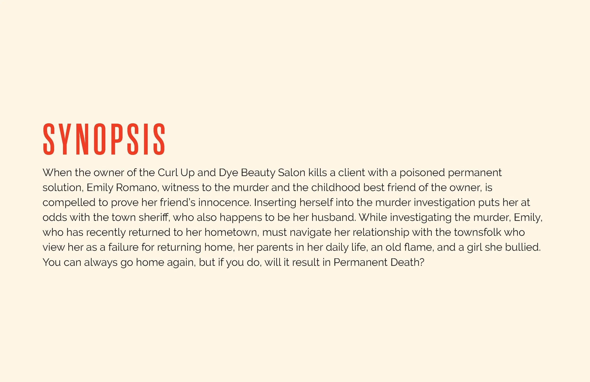
Perminate Death
The Brief:
The collaboration began with a rich but complex brief. The client arrived with several diverging visual paths, ranging from vivid, literal symbolism to minimalist typography. The core challenge was one of tonal balance: the author wanted a striking, memorable cover but feared that leaning too hard into certain imagery—like blood—would misrepresent the book as a "slasher" or "gore" novel, which didn't fit the actual narrative.
The Thought Starters:
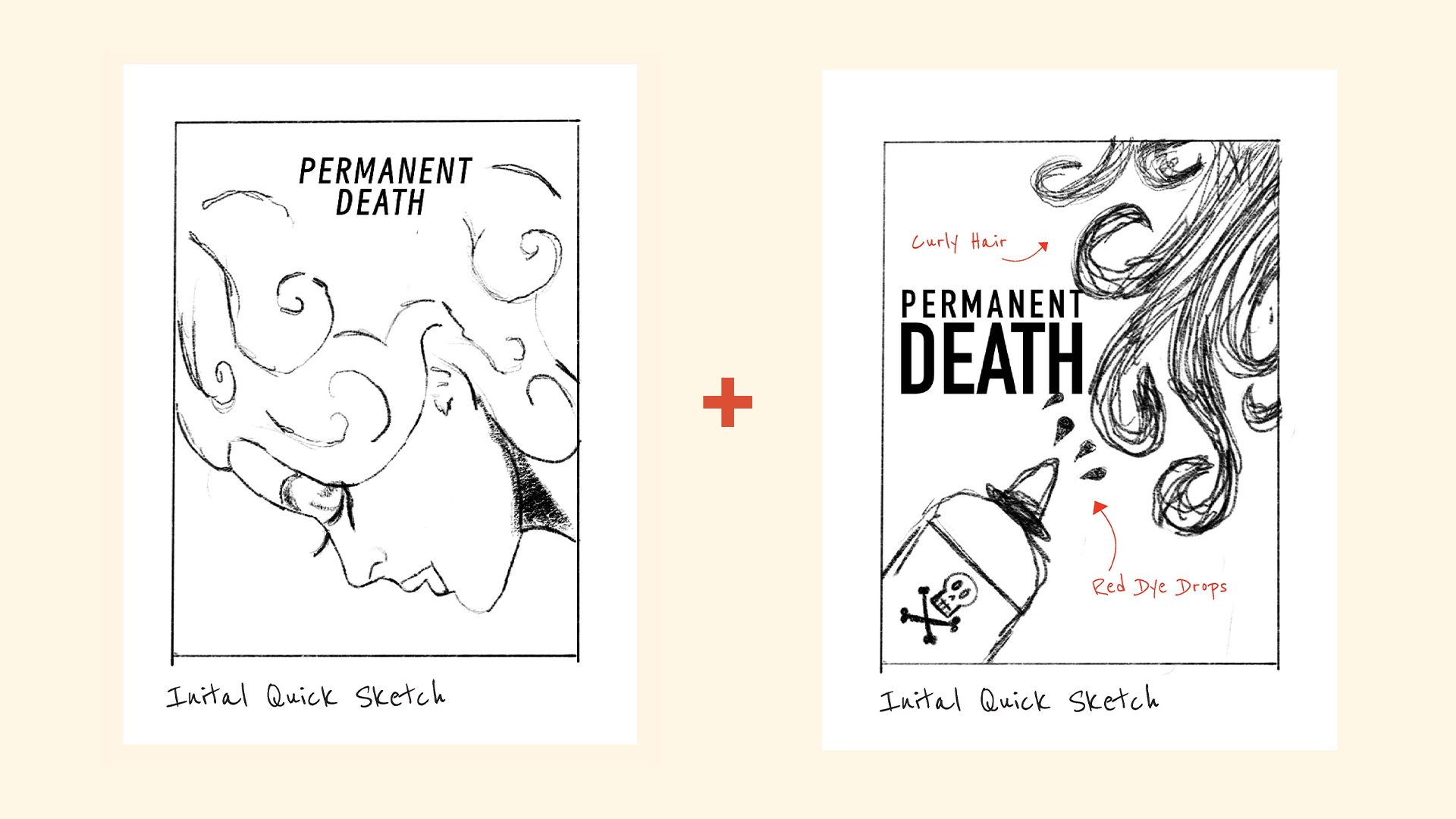
A transition of flowing red hair into drops of blood.
A specific scene involving a figure and a "permanent bottle."
Needs a Stronger appeal to women, particularly because of the female protagonist and the exploration of friendships and relationships.
The Three Creative Strategies
-
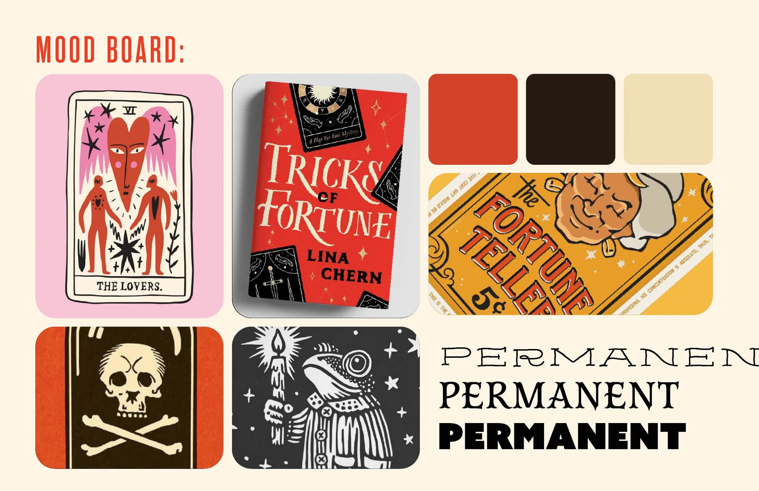
Path 01: Vibrant Visions
The Vibe: High-energy, contemporary, and unapologetic.
The Strategy: Leveraging bold typography and a saturated color palette paired with playful, flat-vector illustrations. This direction was designed to pop on digital shelves (like Amazon or Goodreads) and appeal to a modern, trend-conscious reader.
-
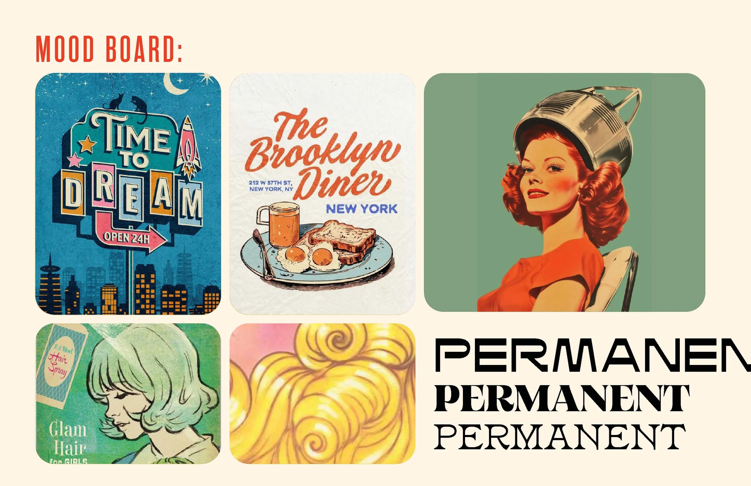
Path 02: Reviving Retro
The Vibe: Nostalgic, elegant, and narrative.
The Strategy: Drawing inspiration from vintage mid-century hair advertisements. This direction used stylized woman-centric illustrations to evoke a sense of history and character-driven mystery without leaning into the "gore" the client feared.
-
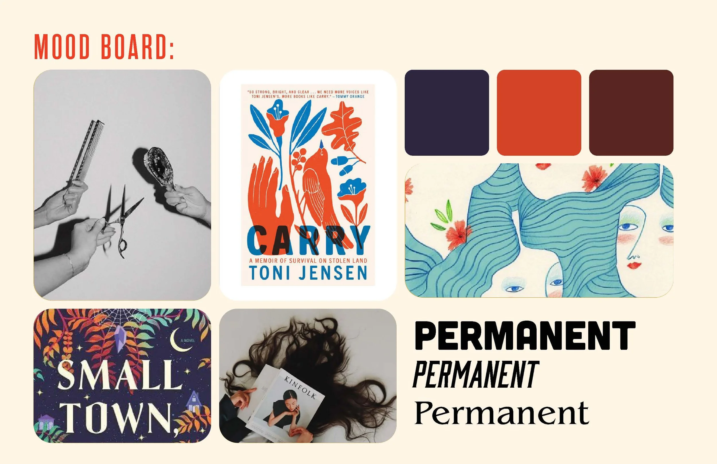
Path 03: Unleash the Curls
The Vibe: Literal, symbolic, and grounded.
The Strategy: A focus on the tools of the trade. By using imagery of hairdressing tools interwoven with curly hair textures, we leaned into the tactile world of the story. This path used symbolism to create intrigue while keeping the "hair-to-blood" concept subtle and sophisticated.
Our Defined Path Forward
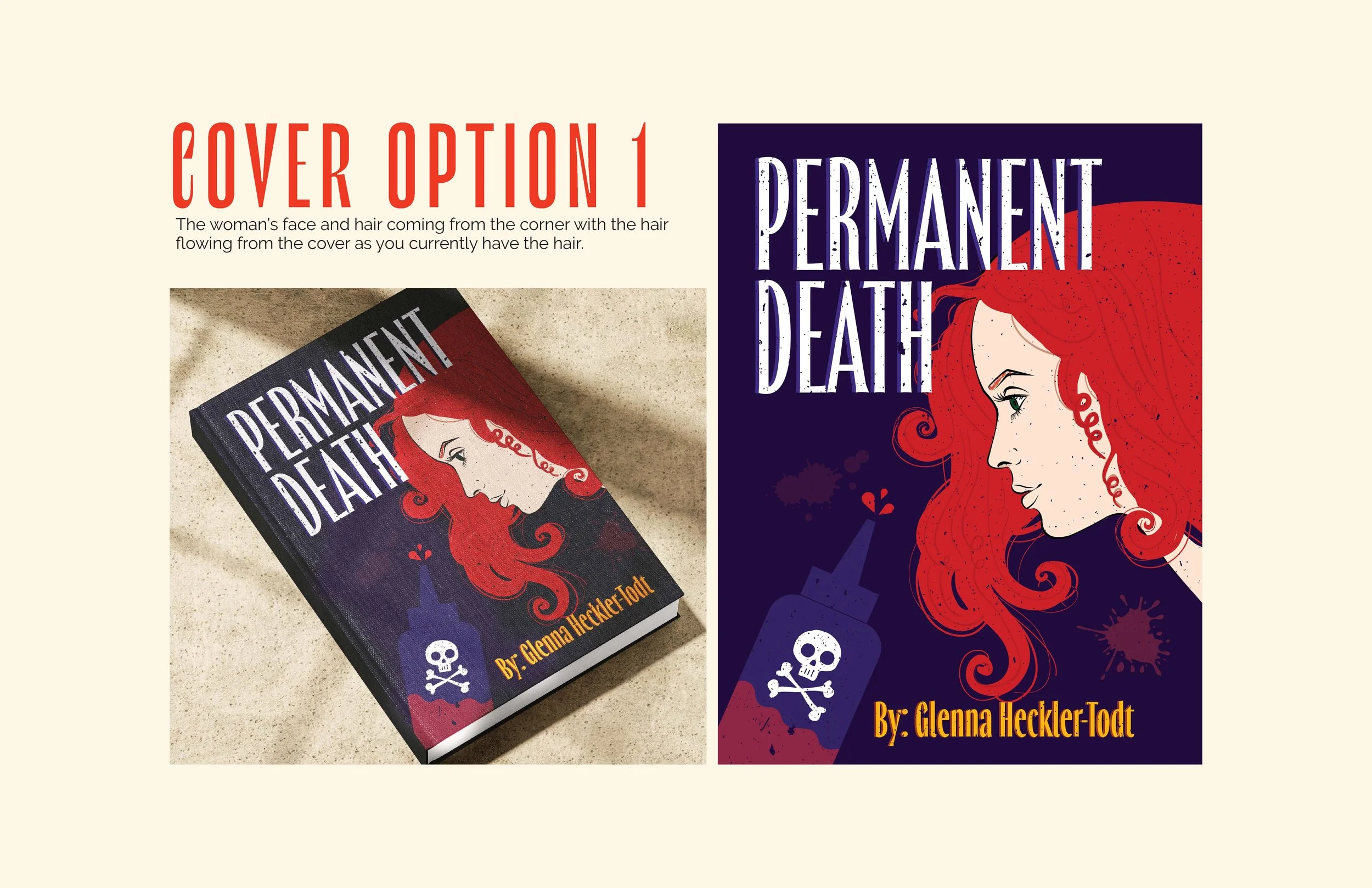
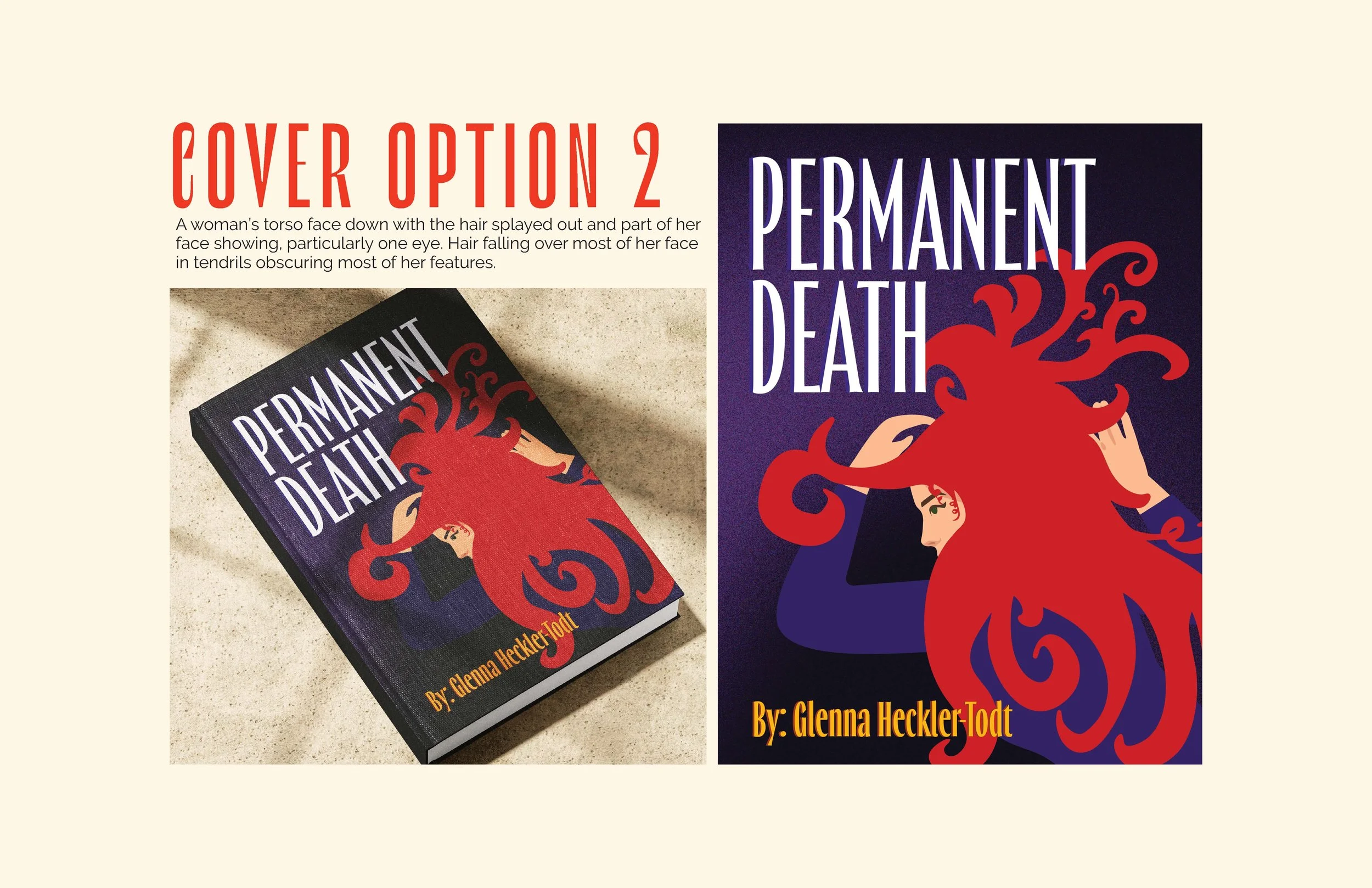
After reviewing the initial strategies, the client chose a hybrid direction. She was drawn to the high-impact energy of Vibrant Visions but wanted to anchor it with the specific thematic elements found in Unleash the Curls. The goal was to create a visual that felt "strikingly trendy" while maintaining a subtle undercurrent of danger.
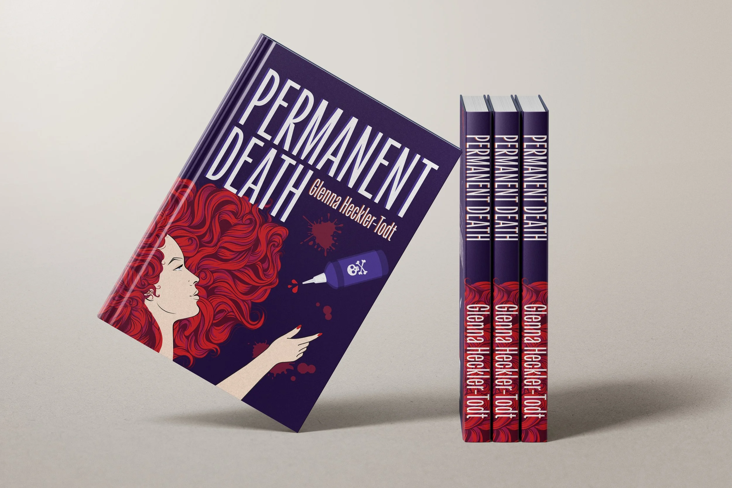
The Design BlueprintThe challenge was to merge bold, contemporary aesthetics with "deadly" symbolism in a way that felt "funky and cool" rather than gruesome.
The Palette & Type: I committed to a high-saturation color scheme and a heavy-weighted, bold typeface. This ensured the book would have maximum "thumb-stop" power on digital storefronts.
The Hero Imagery: We centered the composition on "fiery red" curly hair—using it as both a texture and a narrative anchor.
The "Deadly" Detail: To convey the potency of the story without leaning into gore, I introduced a stylized hair dye bottle. I designed a custom, "funky" skull and crossbones label for the bottle—a playful nod to the "deadly" themes that felt illustrative and modern rather than dark.
Initial Cover Design Implementing Client Feedback
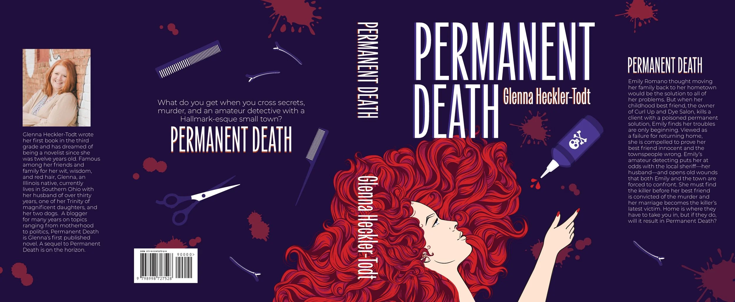
The Outcome
The final cover design is a seamless blend of high-energy aesthetics and narrative intrigue. By merging the fiery, textural elements of the hair with a clean, illustrative approach to the "deadly" dye bottle, we created a cover that stands out in a crowded digital marketplace without alienating the author's core audience.
Book Number 2
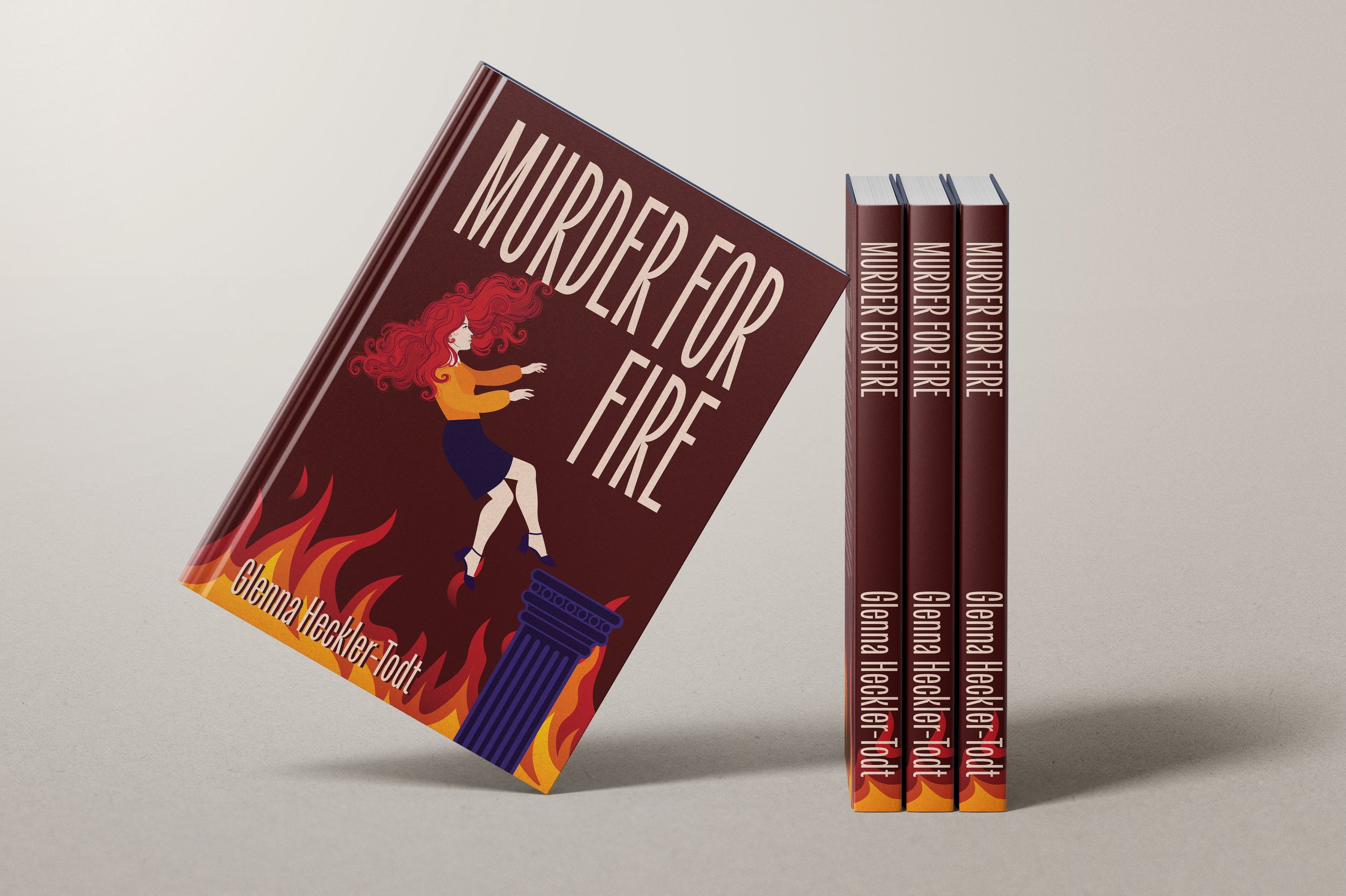
For the second installment of the series, the challenge shifted from "defining the look" to stewarding the brand. The author requested a more mature, dramatic tone to match the narrative’s higher stakes, while maintaining the "Vibrant Visions" energy of the first book.
The Palette Pivot: I transitioned the "Fiery Red" of the debut into a sophisticated Deep Crimson. This created a natural, satisfying progression for readers while maintaining the series' color-centric identity.
Narrative Symbolism: To reflect the character’s internal arc, I designed a stylized, geometric pedestal as the central anchor. By depicting the main character in a state of "graceful chaos" rather than a literal fall, I maintained the original's trendy, illustrative feel.
The Synergy: By keeping the typographic scale and graphic weight identical to Book One, I transformed a standalone cover into a cohesive series brand built for long-term shelf appeal.